Published October 31, 2020: see link below for a PDF version of this article.
MARTIAL ARTS TOKYO – SHOT ON KOMODO – Camera and Workflow Assessment.pdf
See the following links for IPP2-related materials used in this article.
IPP2 Output Presets (https://www.red.com/download/ipp2-output-presets)
RED Creative LUT Kit (https://www.red.com/download/red-creative-lut-kit)
Introduction
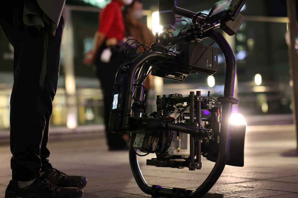
In early September 2020, Mr. Takuro Ishizaka, Director of Photography took the lead in the film “MARTIAL ARTS TOKYO: SHOT”, an assessment of RED – KOMODO 6K (hereinafter called “KOMODO”), with equipment support from RAID Corporation. ON KOMODO, the smallest of the RED Digital Cinema Cameras, features including a high dynamic range 6K Super 35mm global shutter sensor, high resolution touchscreen and Wi-fi remote control, and 12G-4K60P output — a first in RED history. In order to evaluate these features, we decided to create videos that take advantage of the camera’s characteristics, such as handheld and lightweight gimbal shooting, night scenes with high dynamic range, strobe lights that can only be expressed with a global shutter, and high-speed moving objects (action, trains, etc.).
Camera Assessment
On September 8, 2020, we conducted a camera test of KOMODO with the help of RAID Corporation and Kokihifumi Corporation. For the camera test, we focused on people and constructed a scene with a wide range of brightness from dark to light. In addition to three X-Rite Color Checkers, fresh flowers were placed in the scene to produce transparent colors when illuminated by the backlight.
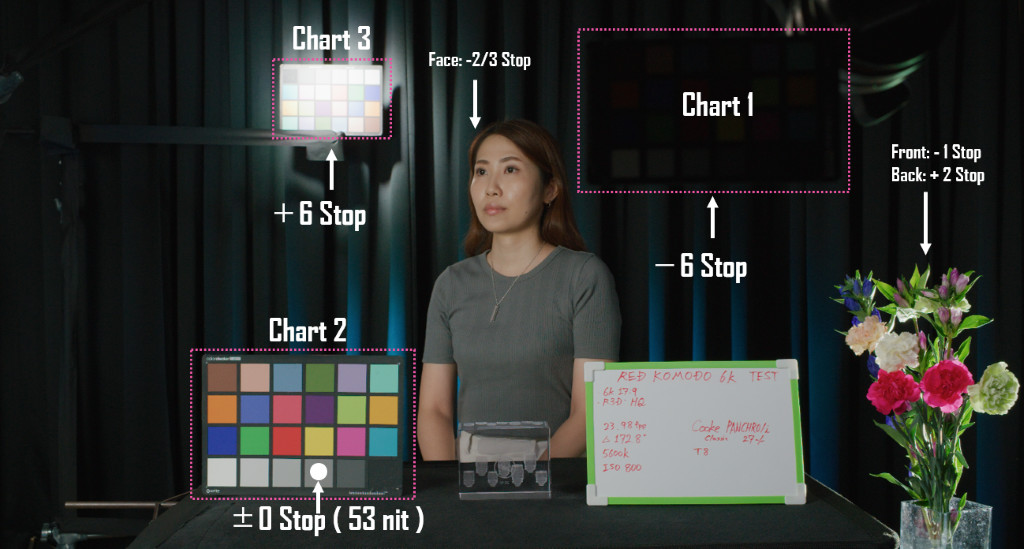
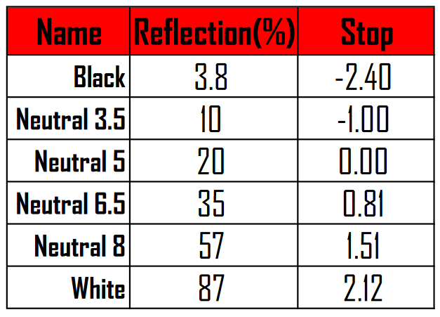
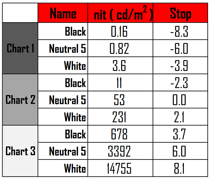
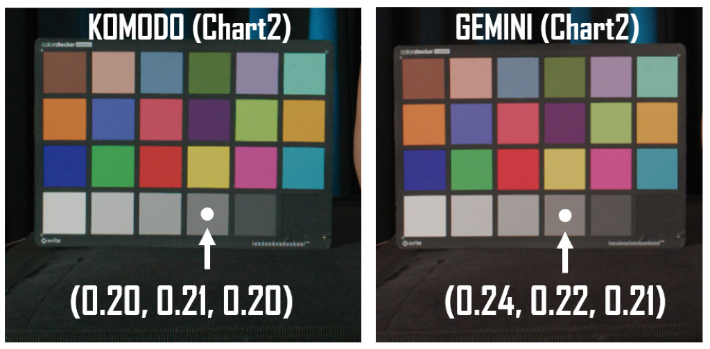
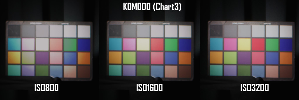
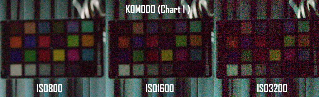
If we take out the achromatic column in the lower row of the color checker, its reflectance[1] is shown in Table 1. First, the color checker (Chart2) placed in front of the person’s left side was illuminated so that the 20% gray (Neutral5) of the color checker (Chart2) was correctly exposed. Next, the illumination of a small color checker (Chart1) placed in front of the person was interrupted and this color checker was adjusted to be 6stops from the correct exposure. Finally, the spotlight was adjusted so that the color checker (Chart 3) at the back left of the person was given +6 stops from the correct exposure.
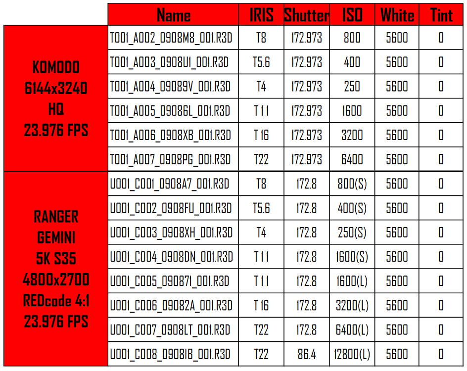
The luminance range for such a scene is shown in Table 2, when the neutral 5 of Chart2 is set to 0 stops. This table shows that this scene has a luminance range of approximately 16 stops from light (+8.1) to dark (-8.3). In this scene, test shots were taken with the KOMODO 6K and the RANGER GEMINI 5K S35 (hereinafter called “GEMINI”) with varying ISO sensitivity. (See Table 3 for the shooting data).
[1] Based on data measured by a color checker in a 5000K environment using a spectrophotometer (PHOTO RESEARCH PR-650), a standard diffuse white (Spectralon SRS-99) and a light box (Just Color Viewing Light S ADVANCED D5000), the reflectance calculated. (September 5, 2016)
Whitebalance
First, We checked the camera’s white balance. When the color temperature of the lighting and the color temperature of the camera are the same, it is easy to control the lighting if neutral gray is reproduced. Therefore, the R3D data was compared in the ACES color space after shooting with the color temperature of both the lighting equipment and the camera set to 5600K. In the experiment with KOMODO, the RGB value of the neutral gray patch with 20% reflectance was ideal to be all 0.2. It was found that the combination of this lighting system with KOMODO allowed us to control the color temperature freely.
[2] Digital Sputnik LIGHTNING DS3
Dynamic Range
To investigate the dynamic range of the camera, we compared images at ISO 800, ISO 1600, and ISO 3200, focusing on the bright portion of the image with six steps of spotlight added, and found that the saturation of the bright portion tended to decrease at ISO 800, while the saturation was maintained at ISO 1600 and 3200 (Figure 4). Figure 5 shows a comparison of images focusing on dark areas. Naturally, the higher the sensitivity, the more noise there is in the image. This film has many highly saturated neon lights and night scenes. We used an ISO range of around ISO 1000 to ISO 1600 as the standard for ISO sensitivity, taking into account the possibility of post-processing de-noise.
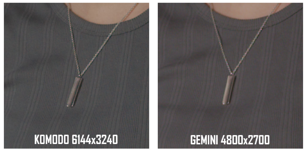
In the comparison between KOMODO and GEMINI at ISO 1600, KOMODO has a performance comparable to the dynamic range and noise of GEMINI. In terms of resolution, KOMODO, which has 6K resolution, has a big advantage. In order to take advantage of this resolution, We decided to record mainly 6K 17:9 in this work.(Figure 6)
Color Pipeline
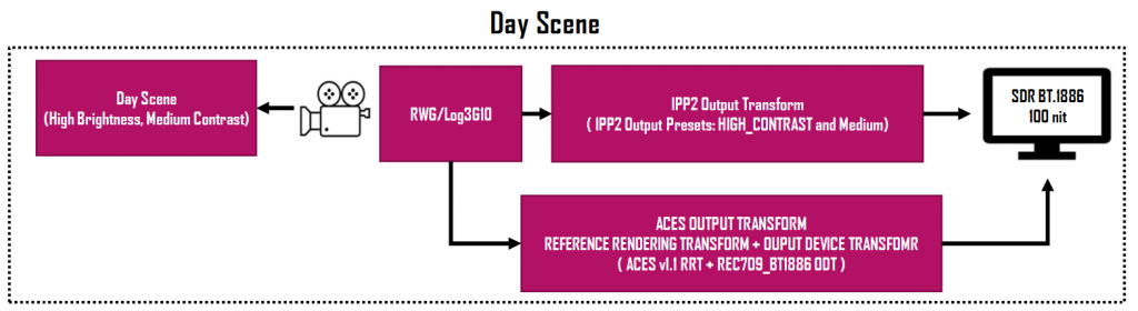
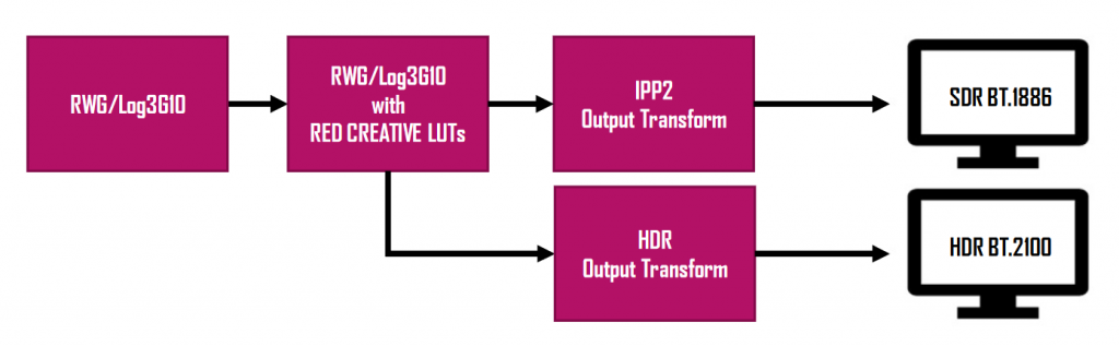
This section describes the color pipeline in the film, “MARTIAL ARTS TOKYO: SHOT ON KOMODO”, from shooting to display. For this film, we chose to use IPP2 (Image Processing Pipeline), which has been implemented in RED since 2017.
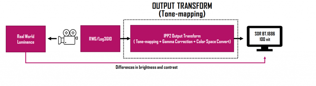
IPP2 allows for technical conversions (gamma and color space conversions) as well as tone mapping adjustments to match the characteristics of the display device by using IPP2 Output Presets , which can be downloaded from the RED Support Website. Such output conversions will enable the future display on high brightness HDR displays while preserving the tones of the captured data.
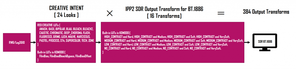
In addition, the RED Creative LUT Kit was distributed by the RED Support Website in 2020. These LUTs can be applied in the first stage of output conversion to add a look without changing the color space of the shot material.
This color pipeline consists of two stages: look transformation that reflects the creative intent and output transformation that is determined by the technical specifications of the display. Furthermore, the output transformation includes color space transformation for each display device and tone mapping to fill in the discrepancies between scene luminance and display luminance. This two-stage color pipeline of look conversion and output conversion makes it possible to create a highly versatile look conversion that is independent of display technology and based on a real-world scene.
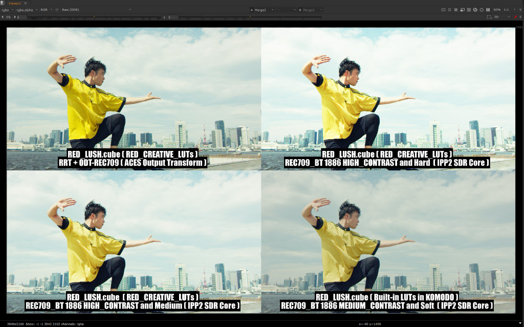
The total number of combinations of these two stages of LUTs is about 400. Therefore, in order to efficiently determine the color pipeline for this work, we created a system that compares and displays the four different LUTs in four sections. In addition, by first determining the output conversions for each scene in the work, we made it easier to select the look conversions that are more dependent on sensory factors.
[3] IPP2 Output Presets (https://www.red.com/download/ipp2-output-presets)
[4] RED Creative LUT Kit (https://www.red.com/download/red-creative-lut-kit)
Look and Tone-mapping
Displaying dazzling real-world luminance on a dim SDR display results in shallow contrast and low-saturation colors compared to memory colors. Therefore, a highly saturated color appearance is virtually reproduced by increasing the contrast using tone mapping.
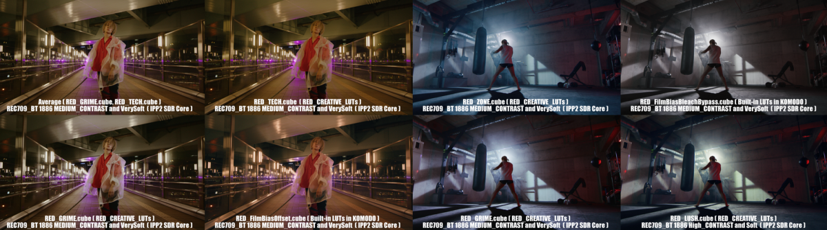
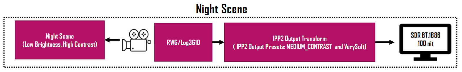
RED’s IPP2 Output Presets allow the user to choose from a number of tone mapping options to suit the scene. This film’s key scenes are set in Tokyo at night with high intensity, highly saturated neon lights and lighting equipment. For all of these night scenes, a roll-off tone mapping option was chosen for the mid-contrast and soft highlights. (MEDIUM_CONTRAST, VerySoft)
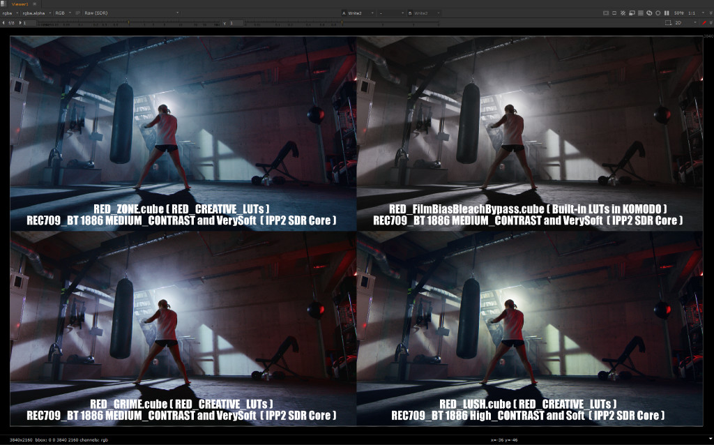
Next, the images with different looks applied to the quad screen were displayed to narrow down the preferred look. For the basement training room scene, the look chosen was RED_GRIME.cube, which had neutral highlights, but also retained the saturation of the red lighting.
Custom Look and ACES Workflow
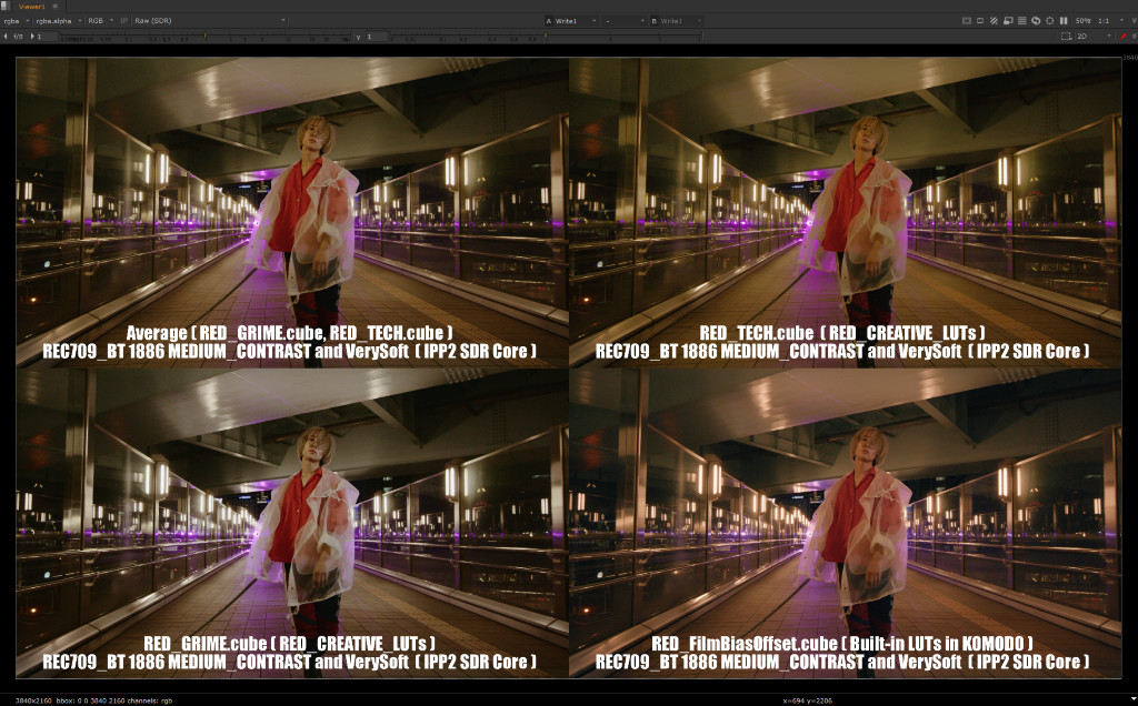
When refining the LUTs in a four-split view, a case arose where we wanted a look in between two preset looks. In this case, I decided to use the additive average of the LUTs to create a custom look. For the night scene of the building, the LUTs were additive averages of RED_GRIME.cube, which had a good skin and white texture, and RED_TECH.cube, which had a strong pink-neon color saturation.
Finally, we will discuss the ACES workflow used for the only daytime scene in this film. Compared to the night scenes, the daytime scenes showed a preference for high contrast tone mapping.
In addition to the RED Output Presets (HIGH_CONTRAST, Hard), the ACES Reference Rendering Transform (RRT) was displayed for comparison. In addition to the high contrast, highly saturated bright areas were preferred, so RRT output conversion was used in this scene.